Projektion von XY-Graphen
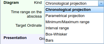
Time-based graphs can be placed in a document's drawing pane using the corresponding tool (). In the edit dialog, you can choose the type of projection to be used under Datasets → Diagram → Kind.
Time-based projection
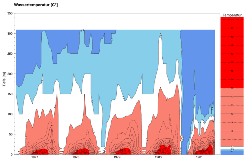
Using a time-based graphs, one or more time series can be mapped to a time axis. Because of the concept of observation ranges, multiple graphs can show their data for the same document-wide date range. The following depiction is an example of a time-based graph:

Parametric Projection
In a parametric graph, the abscissa is not a date axis but another value axis. With this setting, TISGraph expects data points to contain at least two data values alongside the timestamp. A parametric curve is then drawn on the basis of those two values.
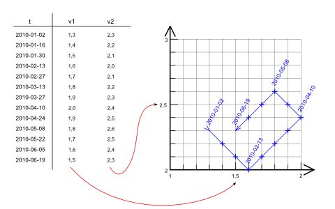
In order to open the dialog with parametric projection pre-configured, you can use the Parametric Graph tool ()
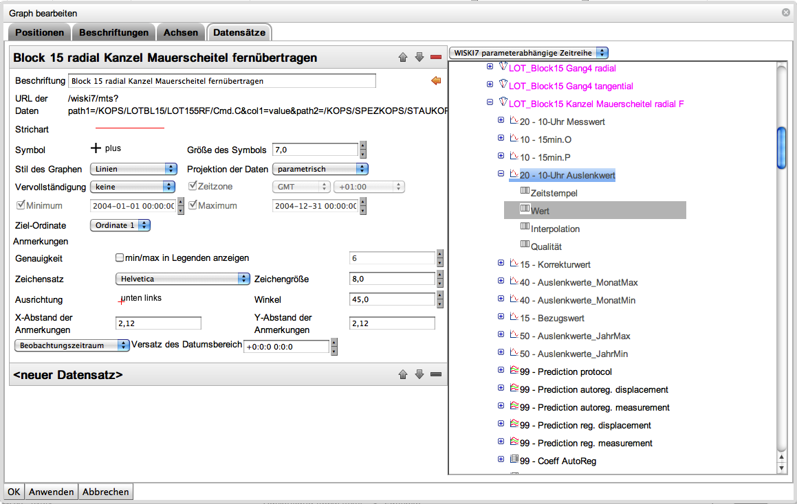
Selecting a parametric dataset from the WISKI database looks like this:
Minimum/Maximum Range
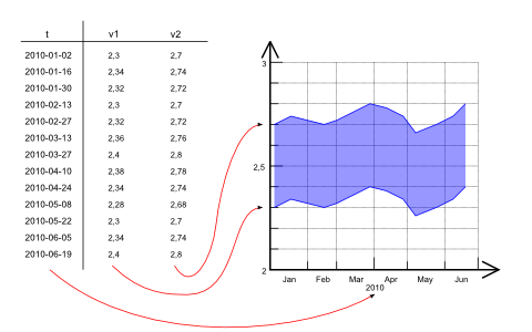
When Minimum/Maximum Range is set, TISGraph expects two values for each data point from the source, in addition to the timestamp. This results in two plots being drawn. The area between the two plots can be filled with a designated color.
Interval Range
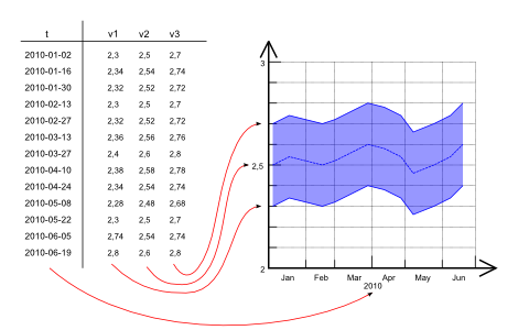
The Interval Range works similarly to min/max range, except that this setting expects three values for each data point. Typically, those would correspond to minimum, arithmetic mean and maximum of a data source.
Box-Whisker
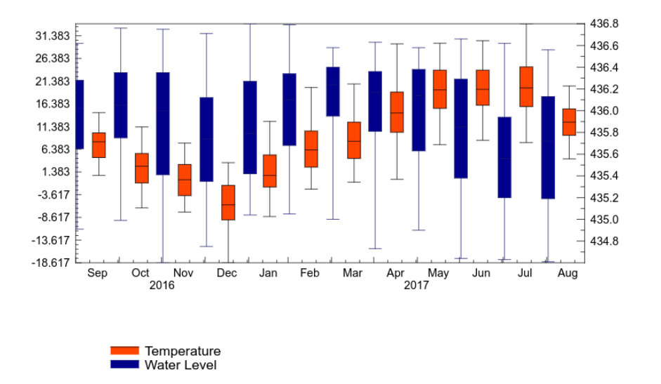
Box-Whisker diagrams can be used to display two datasets with different scientific units, as shown below:
Additional Ordinates
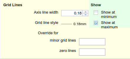
In order to display multiple different data types (and therefore using different units scales), multiple ordinates are necessary (See the relevant chapter on ordinates). It is recommended to place them on the other end of the time axis for better readability, by selecting Show at maximum or Show at minimum respectively:
First Dataset
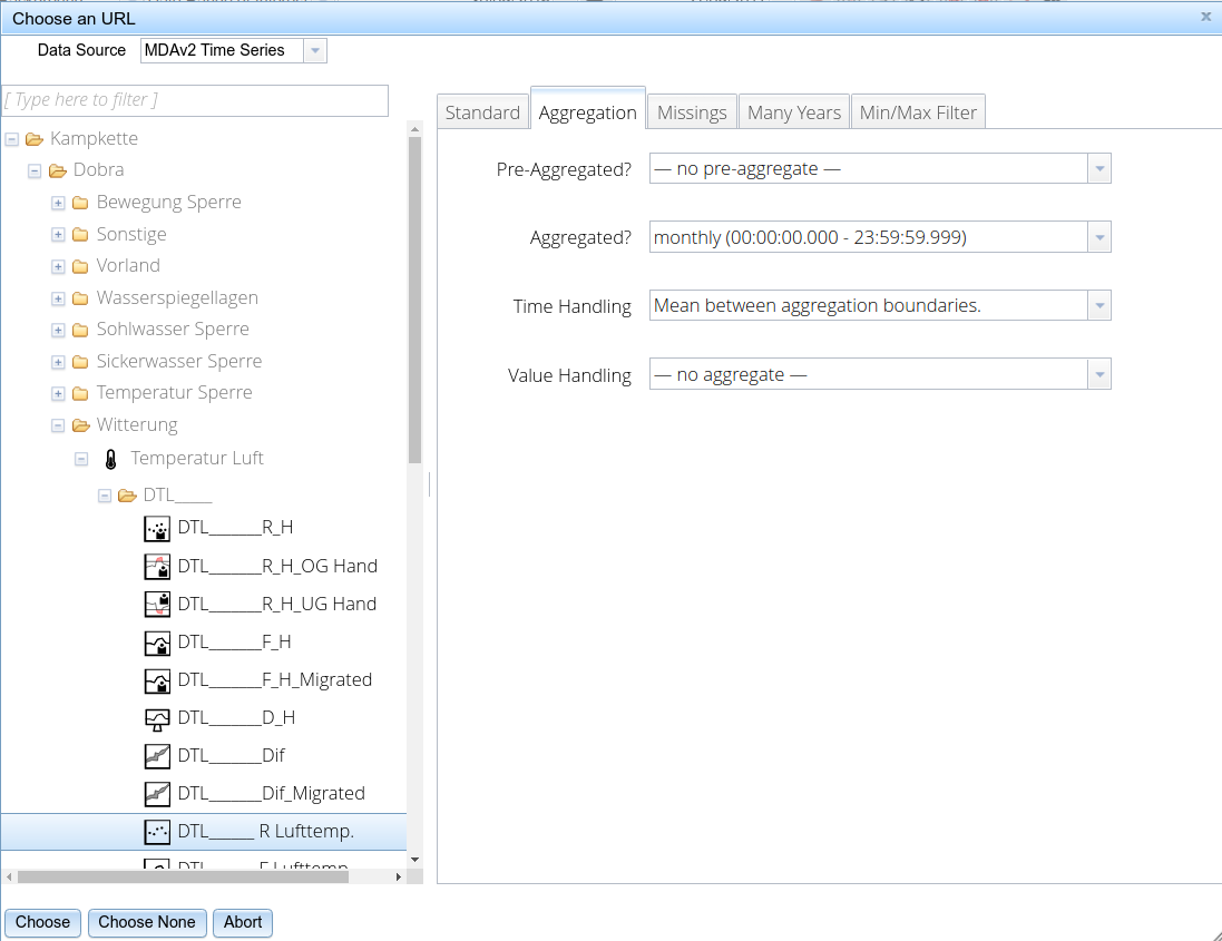
The first dataset of the above example contains air temperature data aggregated monthly.
First, select Box Whisker as the projection type. Afterwards, upon selecting the dataset, set configuration options for Aggregations in the respective tab. In the above shown example, temperature is aggregated monthly and the resulting aggregated value is assigned to the mean of timestamps collected in that month (Mean between aggregation boundaries Time Handling option.)
Second dataset
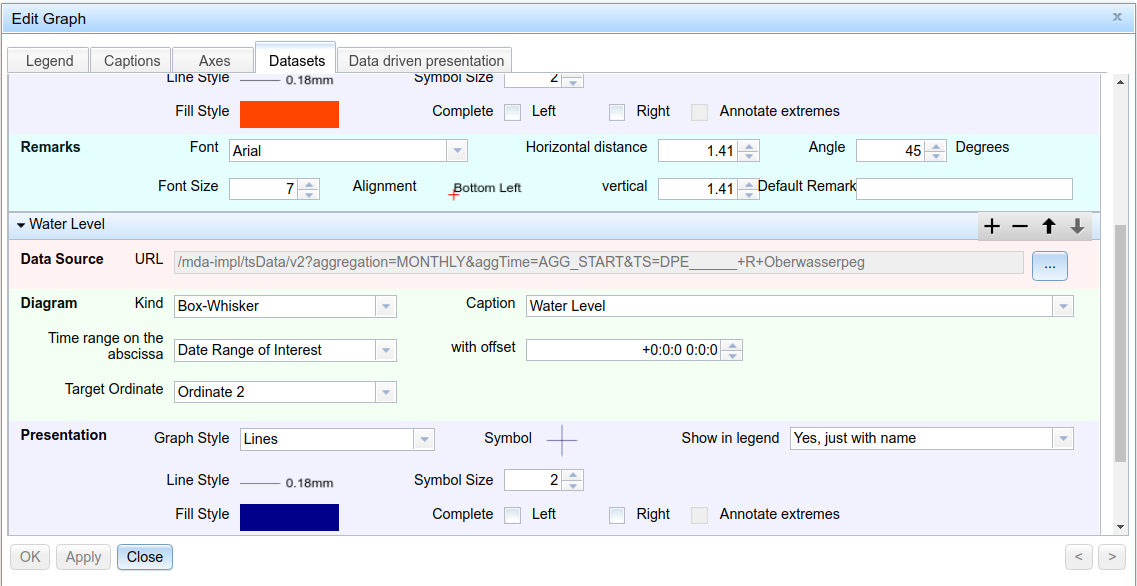
For the second dataset, we chose a water level time series, again aggregated monthly. For clarity reasons, we want to show it on the 2nd ordinate. This time, we selected Lower aggregation boundary as the Time Handling option in order to place each box plot at the 1st of every Month.
Bar Graph
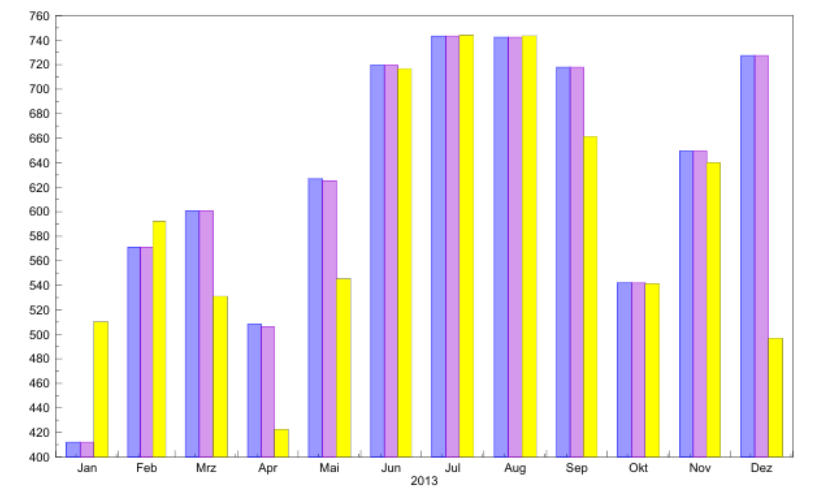
Values are represented as bars on each timestamp. When rendering a bar graph with multiple data sources, bars are grouped for each timestamp like shown:
Isometric View
TISGraph supports two variants of isometric graphs - the regular 2D variant which is shown in the screenshot below, as well as a half-3D variant depicting a cutout at a slanted angle.
